
Corridor signs (directories) in the Palaceside Building shopping street (first floor and first basement, lined with restaurants and shops) were renewed this week (December 16
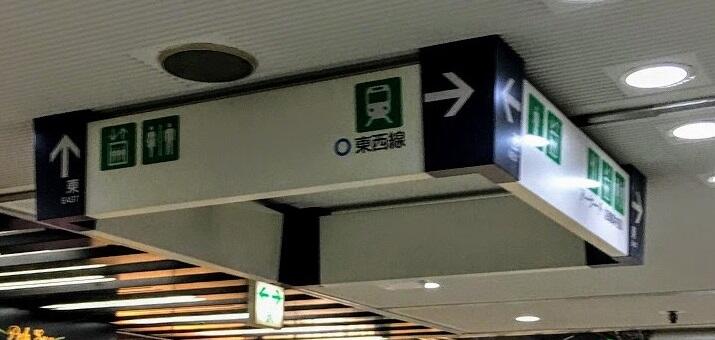
). The photo above is on the first basement, where you come up the escalator from the subway gates — the only four-sided large board here. What it used to look like is the photo at right. Destinations such as arrows, "subway" and "restrooms" have not changed, but the colors are brighter and the marks a size larger, so they are easier to see.
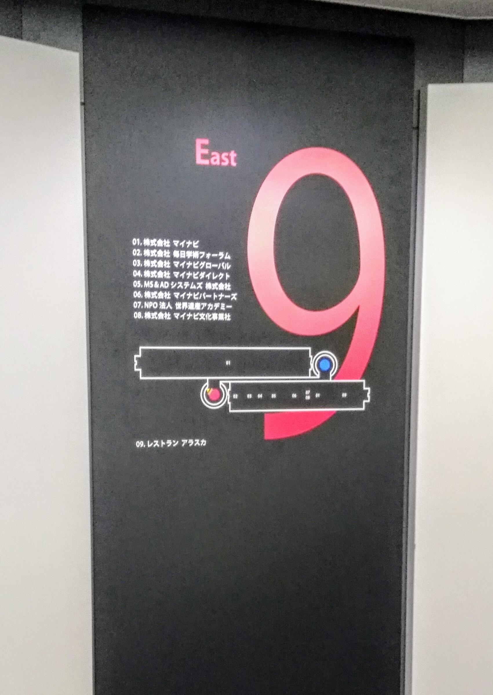
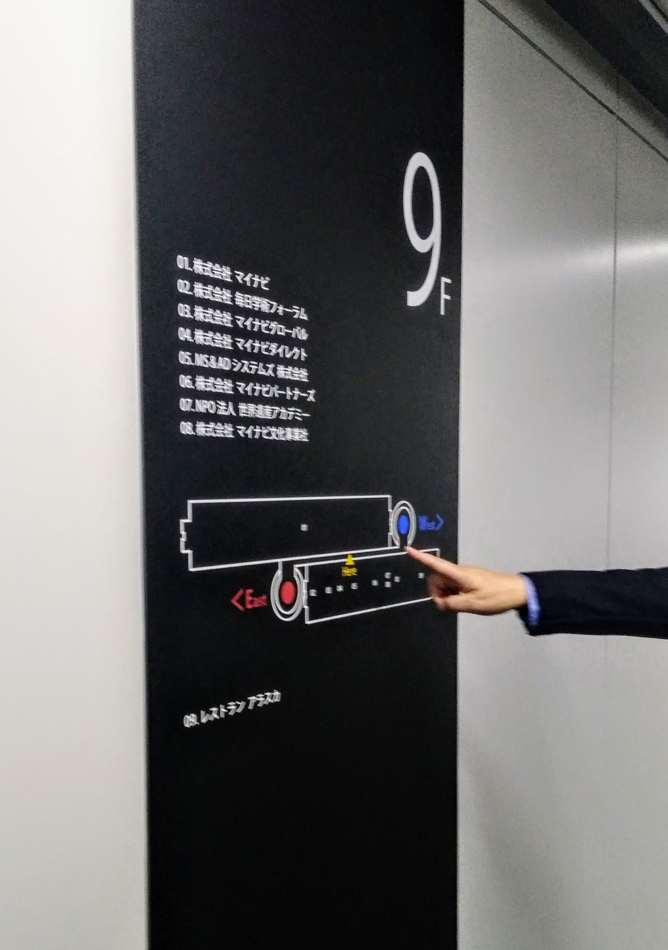
When we reported the office-floor corridor floor renovation the other day (October 21), we explained that this building is a long east-west block some 200 meters across. To keep east and west from getting mixed up, red is the east symbol color and blue the west, with red and blue round marks on the elevator-tower floors. The biggest change in these signs is that east is clearly red and west clearly blue. Restroom and other marks also shifted from all green to a black-red-blue mix for readability (the two photos below are around where the central corridor enters the east and west elevator halls).
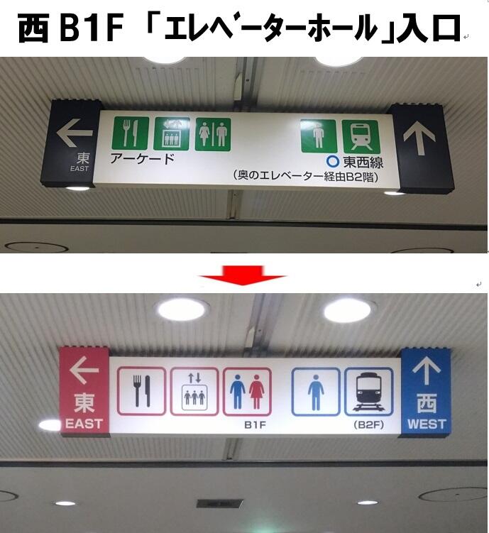
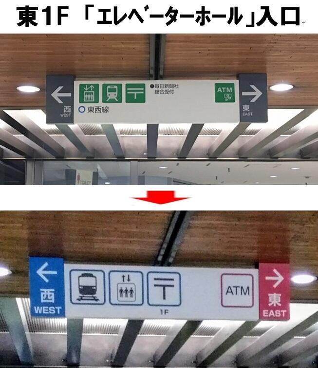
The previous signs had been up more than ten years since a 2006 update; dirt was obvious, and as noted we had heard that east-west orientation and the route to the subway were hard to read, so we renovated with next year's Tokyo Olympics in view.
We renovated five spots on the first floor and 12 on the second. We also added two new signs in the first-floor corridor to the Hitotsubashi entrance at the east end, where there had been none.
On each office floor, along with the floor work, we also changed elevator-hall signs =photos below, left, and added some midway along the long corridors =photos below, right.